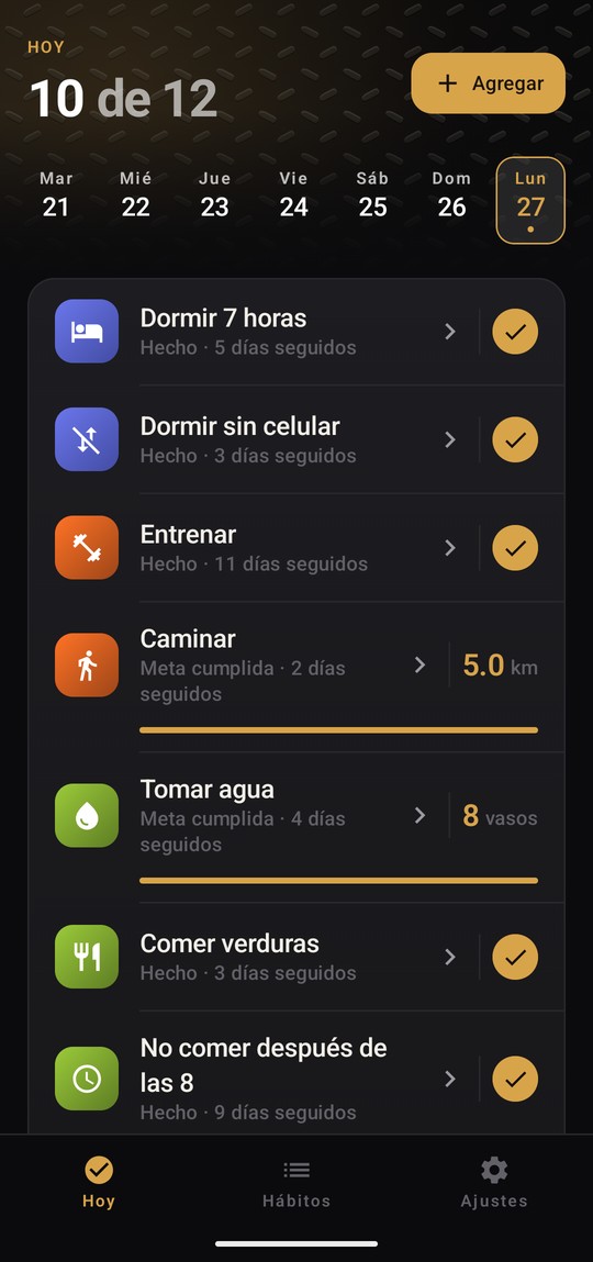
01
I optimized for learning before I optimized for growth.
Hierro Vivo was never meant to be the biggest habit tracker on Google Play. The goal was to learn native Android development and to carry a product the whole way, from the first line of Kotlin through Google's publishing process, forms and policies included.
I had heard that shipping on Play was considerably more involved than deploying a web app. Rather than learn parts of the platform in isolation, I wanted to go through all of it once, on something real, and find out where it actually hurts. The product became the vehicle for that.
I also knew that habit trackers are close to impossible to launch cold. So before the app existed, I built a Facebook audience around self improvement content, so there would be a distribution channel on the day it was ready rather than a launch into silence.
Choosing a project to learn from is a different decision than choosing a project to win with, and the two are easy to confuse.
02
I chose the market I could afford to lose in.
The app exists only in Spanish, aimed at Latin America. There is no English version and there is no plan for one. That was a product decision, not a translation decision, and it was made before any code was written.
English habit trackers are one of the most saturated categories on the store. The Spanish market is not. More importantly, customer acquisition costs in Latin America are dramatically lower than in the United States. I know that from running ad campaigns in the region for marketing clients, not from reading it somewhere, and it means a mistake there costs a fraction of what the same mistake costs in English.
For a project whose real purpose was learning, committing to the most expensive market available would have been the wrong risk to take.
Before starting anything I run the same two minute check. Search incognito, in the country and language of the audience, using the words a real person would type, then look at the install counts. If every result has ten million installs, the category is closed. If products in the tens of thousands still appear on that page, there is room.
Searching for rastreador de hábitos en español returned nine results. Most had millions of installs. One had ten thousand and sat right beside them, which told me that install count is not an absolute wall on a long tail search.
The finding I did not expect
That ten thousand install app has its entire store listing written in English, and it still surfaces in a Spanish search. Google Play matches by meaning rather than by exact text.
That mattered, because the obvious plan for a Spanish app is to load the listing with Spanish keywords and assume that is the advantage. It is not. Being in Spanish does not win the search on its own, which meant the listing had to earn attention some other way.
03
One rule ended up deciding almost everything.
Every habit tracker has to answer a question most of them never ask out loud. What does an empty day mean?
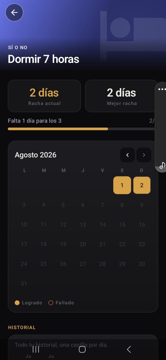
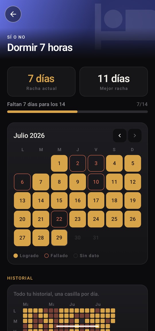
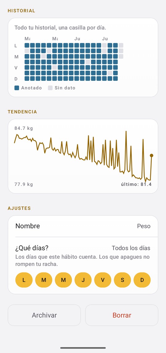
In Hierro Vivo, a day nobody logged is unknown. It is never recorded as zero.
That sounds like hair splitting until you try it on a habit like "no more than three coffees." Zero coffees is the best day you can have. A blank day is a day nobody answered. Treat them the same and every day you forgot the app existed counts as a perfect one, and you finish the month with a record you did not earn.
A streak the app gave you is worth nothing.
Once that was settled, a lot of other things settled with it. The calendar needed a way to show a day nobody answered. The monthly percentage had to leave those days out instead of marking them failed. Today and tomorrow never get scored at all, because the calendar draws the whole month and the rest of the week is not a week of failures yet.
04
A daily limit is not a daily goal with the sign flipped.
There are four kinds of habit in the app. Yes or no, a daily goal, a daily limit, and one that only gets logged. The limit is the one almost nobody gets right, and it goes wrong in three different places.
The first is the one above. A blank day cannot quietly become a zero, or the app hands out perfect days to somebody who was not there.
The second took me longer to see. On a habit you are trying to cut down, zero is not just a legitimate answer, it is the best one. So zero cannot also mean "nobody said." That is why unticking a box wipes the entry instead of writing a zero in it. The entry existing at all is the only proof a person answered.
The third is not about the numbers, it is about what the bar means. On a goal, a full bar is ground you gained and it feels good. On a limit, the same bar is money you have already spent, and full is the edge of the cliff. It keeps going past full on purpose, because there is a real difference between three coffees and five and the bar should show it. And a limit of zero, like zero cigarettes, is not really a bar at all. It is empty while you are clean and full the second it breaks.
05
The business model had to agree with the product.
Almost every habit tracker in the category sells the same thing. Miss a day, lose your streak, pay a small amount to repair it. It is a good business. People will pay more to avoid losing something than they will to gain it, and the product manufactures that loss on a schedule.
Hierro Vivo does not have paid streak repair and will not get it.
The reasoning is short. Streak repair sells someone a version of their own past that did not happen. An app built to record what actually occurred cannot also sell a record of what did not. The rule that made the product worth using and the rule that would have made it money point in opposite directions, so one of them had to go.
That removes the standard revenue mechanic of the entire category from the table. Ads are the plan instead, in a later version. It is a smaller business and a coherent one.
An app whose whole premise is honest streaks cannot sell dishonest ones.
06
The architecture started with responsibility, not privacy.
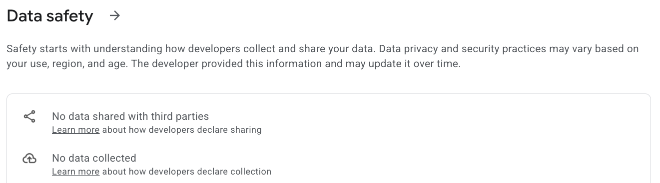
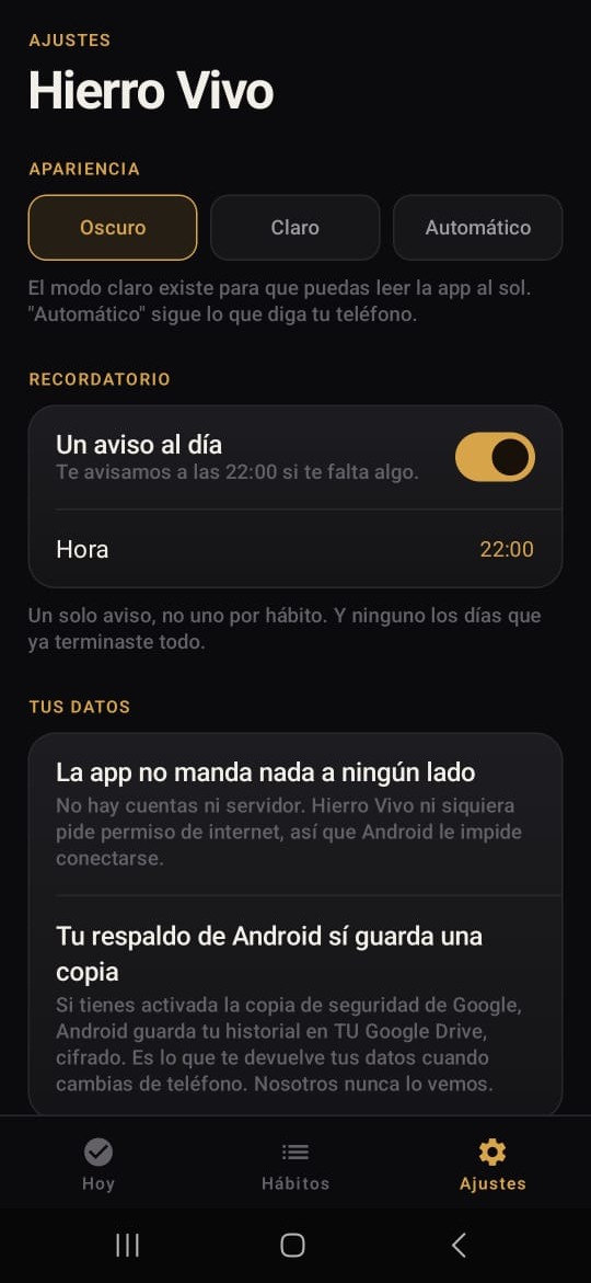
There are no accounts, no login, no cloud, no analytics, and nothing borrowed from anybody else's code. The app never even asks Android for permission to use the internet, so the phone itself blocks any attempt to connect, including one I wrote by accident. Nothing leaves the phone, and that is not a promise, it is just the only thing the app is able to do.
The easy way to tell that story is as a stand on privacy. It was not one, and the real reason is more useful.
I am not an engineer. I use AI to build working software so I can test ideas with real users instead of stopping at a wireframe. Anything I plug in is something I then have to keep safe, keep running, and answer for at two in the morning. A server, accounts and other people's data are all things I would rather not be responsible for. The privacy is real. It just showed up as a side effect of that, not as the reason.
Every tradeoff comes with a bill, and this one is easy to read. If it all lives on the phone, wiping the phone wipes everything.
So you can save a backup file and load it again, and the load button is on the first screen you see, not buried in settings. Somebody who needs it has just reset their phone and is worried they lost months of work. Settings is the last place they will think to look. The settings screen also admits that Android's own backup keeps an encrypted copy in your Google Drive, because saying nothing leaves the phone without that line would not be true.
What this costs me
Since the app collects nothing, it cannot tell me whether anybody comes back. Google tells me how many people installed it and how many deleted it, and nothing else. Everything that happens inside is invisible to me. Somebody deleting the app is the only honest signal I get, and plenty of dead apps just sit on a phone forever.
This is the second product where I gave up being able to see what is happening rather than hold data I did not want to hold. I would make the same call again. It still costs me something, and I would rather say so than pretend it is free.
07
Every idea goes through the same filter.
I keep a written list of things I decided not to build, with the reason attached to each one. It is more useful than a roadmap, because a roadmap tells you what somebody hopes to do and a kill list tells you how they think.
A quit smoking app. It solves one problem well, and when it works the person deletes it. That makes it a feature rather than a product.
A calorie counter. It dies on the food list. Thousands of foods, somebody keeping them current forever, wrong numbers everywhere, and a server to hold it all. The version that survives does not count calories at all. It asks whether you ate vegetables, fried food and sugar, and how much. Which is the four habit types this app already has, pointed at food.
Anything with a feed. Accounts, somebody policing what people post, and a bill every month, all for something that is not the business.
The same test kills all of them. No server, no account, nothing that has to connect. That is not minimalism for its own sake. It is what lets one person build the thing and still be able to support it, what makes "nothing leaves your phone" true instead of marketing, and what keeps it costing nothing to run.
Twelve apps are twelve permanent obligations. Policy changes, a target SDK bump every year, forms, crash reports, reviews to answer. It grows and time does not.
08
Designing something that does not look free.
Free utility apps give themselves away with saturated color and pure white. A user reads that as cheap before they have read a single word, and once an app looks free it is very hard to make it look like anything else.
So the base palette has no pure values in it. The dark background is #0B0B0D rather than black. The text on it is #F2EFE9, bone rather than white. The light background is warm paper, not a sheet of #FFFFFF. On a phone it reads as black and white, and it is neither, which is the whole trick. There is one brand color, amber, and everything else is charcoal and bone.
The eight habit categories then needed their own colors, which flatly contradicts a one accent rule. It is worth being precise about how that gets resolved, because it is a systems answer rather than a taste answer.
First, the colors themselves. The initial attempt picked each one on its own merit and produced a real problem: two pairs landed close enough on the color wheel that the eye read each pair as a single category. Training and Reduce Vices were six degrees apart. Sleep and Measurement were twenty nine.
The fix was to stop choosing colors and start dividing a wheel. Eight categories spread across it, with a minimum of twenty seven degrees between neighbors. If a ninth category is ever added, the wheel gets redivided rather than the new color wedged into the nearest gap.
Two categories changed meaning in order to fit, and both improved. Reduce Vices moved from ember to crimson, which reads as a warning rather than as warmth. Money moved from brass to emerald, which is the color money already is, and the brass had been the only one of the eight genuinely competing with the brand amber.
Second, and this is the part that keeps the rule intact: those eight colors appear in exactly one place, the band across the top of a habit page, behind a gradient that dissolves into the background. Nothing else in the app uses them. Every control, label and chart underneath is still amber on charcoal. The brand color is protected by position rather than by being the only color in the product.
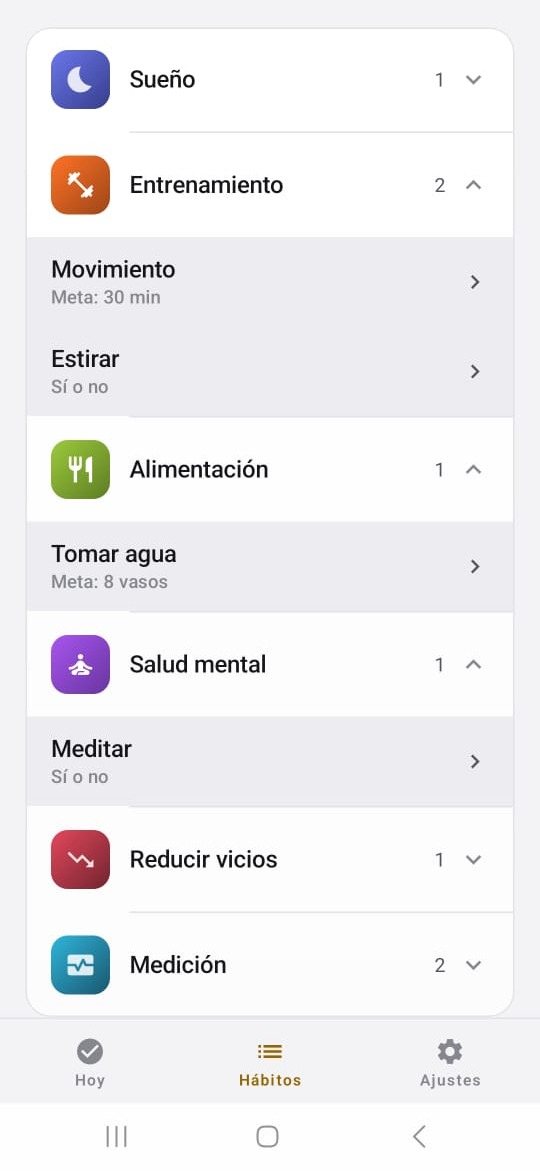
The largest simplification came later, and it started as a mistake. Every category originally had a photograph behind it. That works until you notice one photo has to serve every habit inside the category. The candle behind Mental Health was right for Meditate and absurd behind Read.
Twenty eight photographs would have solved it, and were never going to happen. Each one needs sourcing, a license check, and a review for recognizable faces and visible brands. The fix inverted the relationship instead. The background says the category and the icon says the habit. Coffee gets a cup and Beer gets a stein off the same band, at no cost in licenses, review, or file size.
The part that made it clearly right rather than merely cheaper: it covers habits the user invents themselves, which never had a photograph and never would have.
09
Writing an app in a language that makes you pick a gender.
Spanish forces a gender choice on nearly every adjective. English lets you write "done" and move on. Spanish makes you decide, on every string, whether you are talking to a man or a woman.
The usual answers are both bad. Pick one and you have quietly told half your audience the app was not built for them. Write both and every screen fills with slashes and parentheses.
So the app never puts an adjective on the person. It describes days and habits instead. Achieved, failed and logged all describe the day, not you. Even the tagline is a verb, and a verb has no gender.
This was checked string by string. There is not one masculine adjective addressed to the user anywhere in the app, and the test for anything written since is simple: if you have to choose between the masculine and feminine ending to address someone, the sentence is built wrong and gets rewritten rather than duplicated.
A rule that outlived its own reason
The listing and the interface never name an audience. That rule started for a commercial reason, because the audience was assumed to be men, and saying so out loud shrinks the market you can sell to.
The assumption turned out to be wrong. Rather than delete the rule, I kept it and wrote down that it now exists for a better reason: there is nobody to exclude. Rules that survive a change in their own premise are worth re-examining, not just inheriting.
10
Thirty characters is the whole first impression.
The Play Store gives you thirty characters for a title. That is your whole pitch to somebody who has never heard of you, and it is also what Google reads when it decides whether to show you.
The first version used the Spanish word for streaks. Accurate, and the wrong word, for a reason that has nothing to do with competition. The only person who types "streaks" is somebody who already thinks in streaks, and that person already has one of these apps on their phone. Coming first for a word nobody searches is worth nothing.
The word that replaced it means routines. Not a synonym, a different word, typed by somebody who wants exactly this and does not know yet that the category has a name. It reaches past the people already in the room.

Two things came out of the listing before it went live, and both were things I deleted rather than added.
The short description used to end on "no ads." True when I wrote it. Ads are coming in a later version, and the day they arrive that sentence turns into a lie I put in writing myself. Promising something you already know you are going to break is the fastest way to collect one star reviews, because people quote your own listing back at you. I kept "works offline," because that one survives.
The second one was harder to spot. A whole section explained that the app sends one reminder a day instead of one per habit. I wrote it as a good thing, meaning we leave you alone. Then I read it the way somebody with three apps open in three tabs would read it, and it sounds like something missing, because everyone else offers a reminder per habit. The app did not change. The listing just stopped bragging about it.
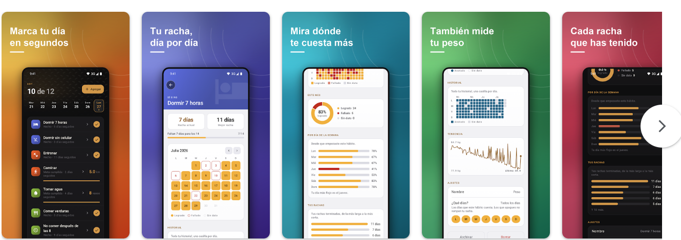
Inside the product
Four habit types, one honest scoreboard.
-
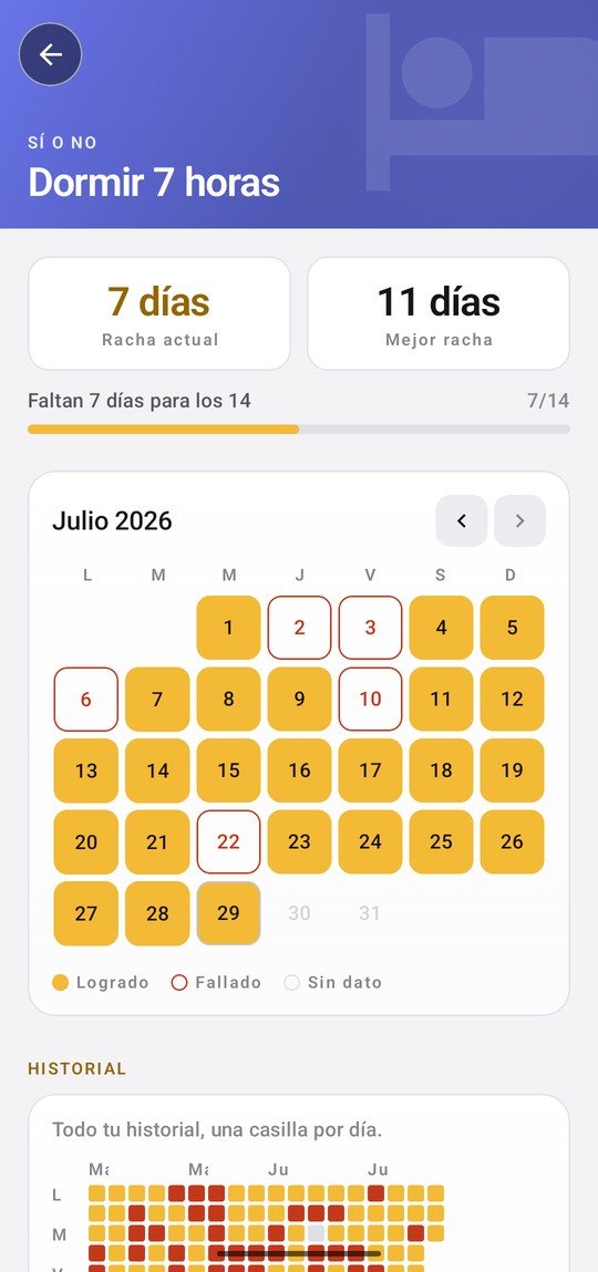
The same calendar in light mode, which exists so the app is readable outdoors.
-
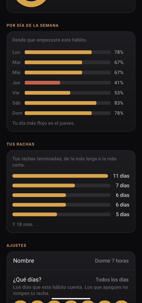
Your worst weekday, drawn in red. Most people cannot name it about themselves.
-
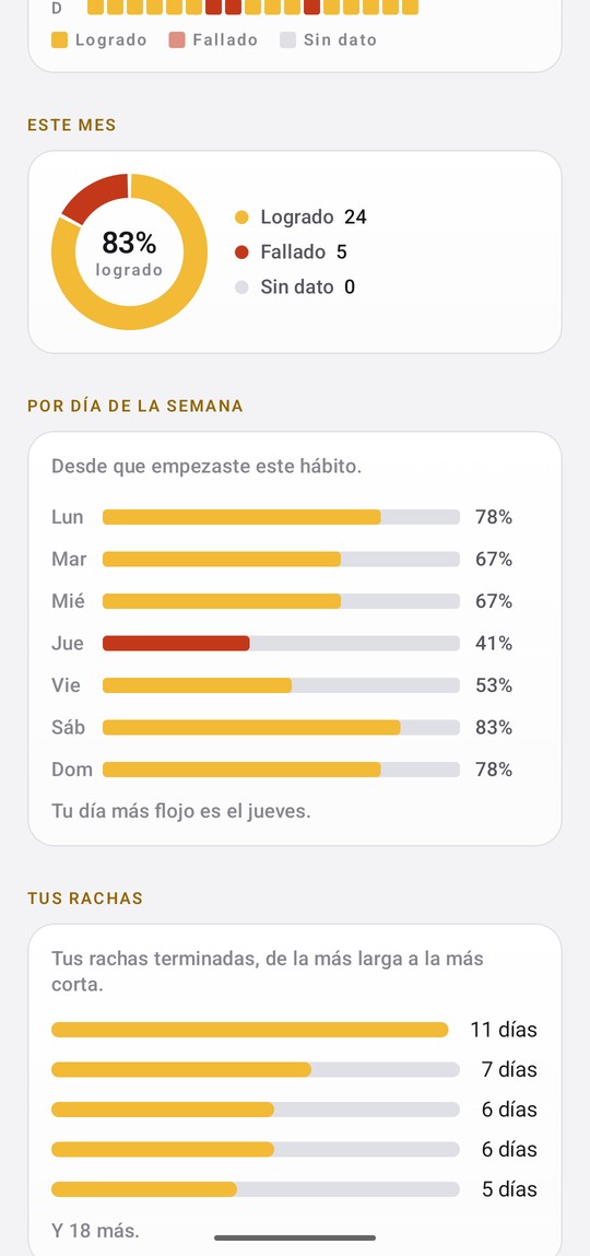
Finished streaks, longest to shortest, rather than only the current one.
-
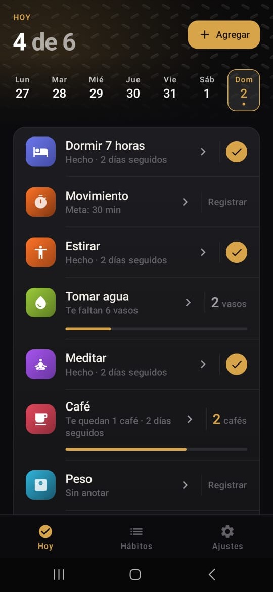
Goals fill up. Limits count down. The same bar means opposite things.
-
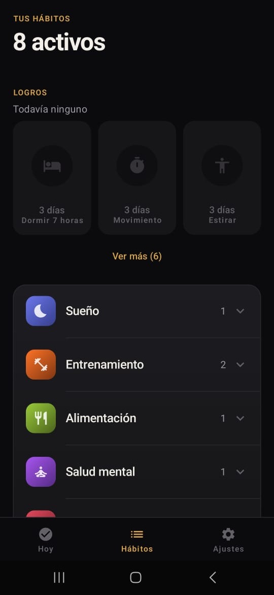
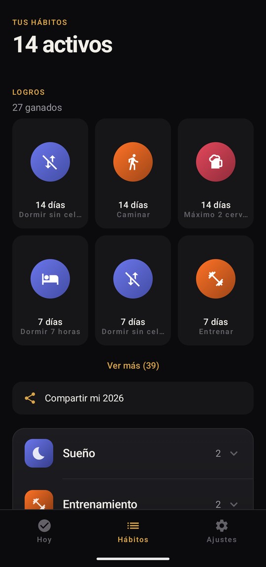
Badges come from your best streak, so once earned they cannot be taken back.
-
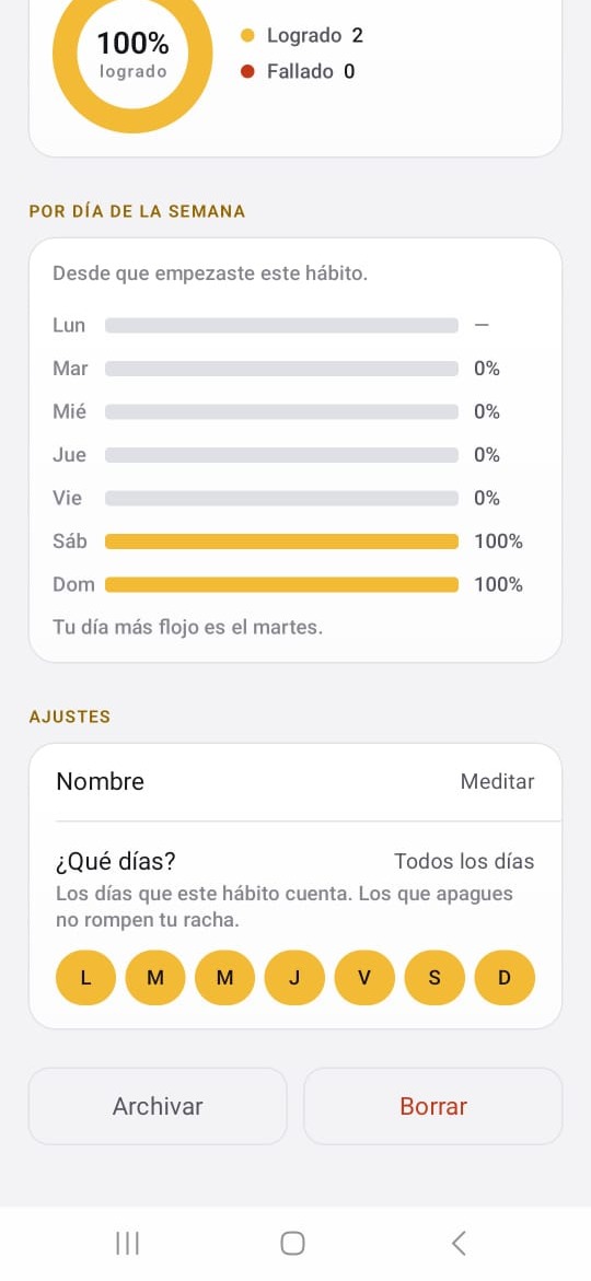
The month percentage ignores days nobody answered instead of failing them.
11
What I got wrong
I recorded a failure that did not exist.
A reminder set on a Samsung phone never arrived. I concluded that Android's battery optimization was killing the alarm, wrote it up as the most serious risk in the project, and made it a blocker on closed testing.
The time picker runs on a twenty four hour clock. I had set 8:50, which is the morning, and I was waiting for the notification at nine at night. The alarm fired correctly, about twelve hours before anybody was watching for it. The diagnosis was more expensive than the bug, and the bug was not there.
What I kept from it is not the embarrassment. If the person who built the app can misread his own time picker, a tester can too, and their version of this story does not end in a diagnosis. It ends in "I never got the notification," with nobody finding out why. I considered switching the picker to follow the phone's own clock setting and left it on twenty four hour, because that is how time is written in the region. It also gave me the exact question I now plan to ask every tester: did the notification arrive, and about what time. The second half is the half that matters.
I am paying for the wrong kind of testing.
Google requires twelve testers enrolled for fourteen continuous days before a new personal developer account can request production access. Half my list is a paid QA service.
QA tells you whether something is broken. It cannot tell you whether it is worth using, because somebody paid to open an app every day for two weeks will not abandon it the way a real person would. Bugs will come from the paid group. Any signal about whether people actually keep using it can only come from the other half, and I set that up without thinking about the difference.
I chose a metric my own architecture hides from me.
What I care about is stickiness rather than installs. Whether people are still opening it at thirty days, not how many downloaded it in week one.
The app cannot measure that, because I built it to collect nothing. I picked the right thing to care about and then made it structurally invisible, and I did those two things in that order without noticing the conflict.
12
What I cannot tell you yet.
Nobody outside me has opened this app. It is published in closed testing, not in production, and there is no usage data, no feedback, and no retention curve to show. Every decision on this page is reasoning, not a result.
That means the interesting questions are all still open, and I would rather name them than dress up the ones I can answer.
- Does the difference between an unknown day and a logged zero survive contact with somebody who has not read a word about it? It is the reason to choose this app and it has never been explained to a stranger.
- Does refusing paid streak repair cost revenue, cost nothing, or quietly become the reason somebody stays?
- Does local only storage read as safe or as fragile? The same fact can land either way depending on who is holding the phone.
Closed testing is the first chance to answer any of them, and the one question I care most about asking is not about bugs. It is which habit somebody stopped logging, and why. That is answerable honestly, it cannot be deflected with "it's nice," and it goes straight at the only thing that matters for a habit tracker, which is whether anyone opens it again.
A habit tracker nobody opens twice is worth zero, no matter how correct its scoring is.